Clarity for Brand Transformations
Your company is planning to go through a big transformation.
Now it’s time to switch focus to your brand: A new brand strategy will need to be developed, the perfect brand name crafted, and a new brand identity rolled out.
There are many stakeholders, and a lot is at stake; yet it must happen quickly.
We Are Ready to Enable Your Re-launch.
SCHEDULE A CALL
MEET FABIAN GEYRHALTER
Fabian is the founder of FINIEN and a partner at Chameleon Collective. He ran a successful branding and design agency for twelve years; then he realized that the traditional agency model no longer benefited today’s businesses. He closed shop, wrote his first best-selling book, How to Launch a Brand, and in 2013 relaunched with a process in tow that transforms brands in a swift and focused manner. He works in an approachable way with founders and CMOs hands-on to establish brand clarity and focus.
Clients include:
We Are Ready to Enable Your Re-launch.
SCHEDULE A CALL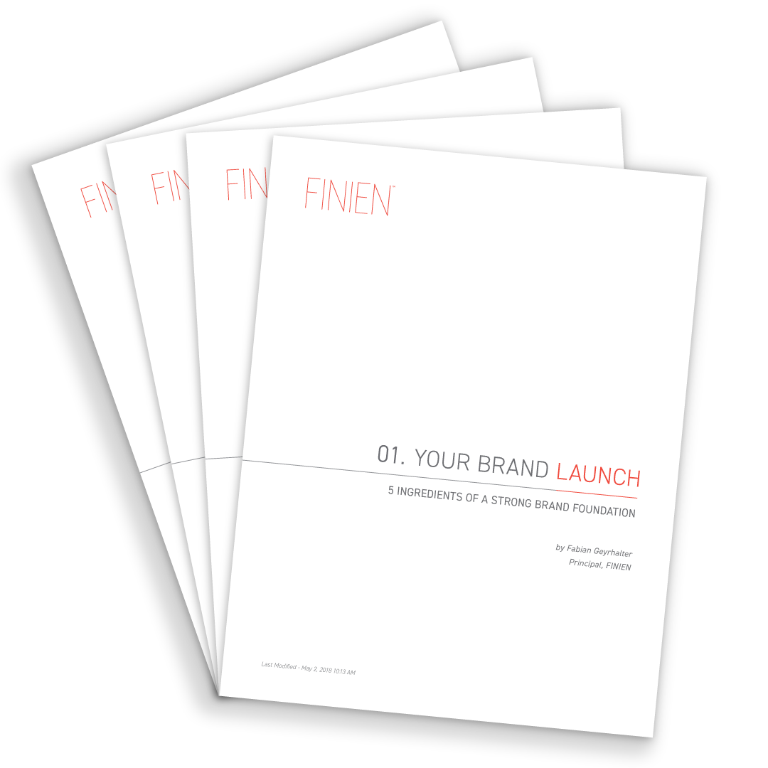
STRATEGY DOWNLOADS
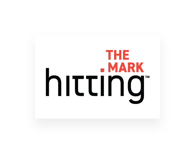
Hitting The Mark
Conversations with founders and investors about the intersection of brand clarity and startup success
Fabian sits down with some of today’s most inspiring founders to discuss how they have defined their brand's DNA.
Past guests include Trevor Milton of Nikola, Phil Libin of Evernote, Mikael Soderlindh of Happy Socks and Stacy of Stacy’s Pita Chips.
 Listen Here
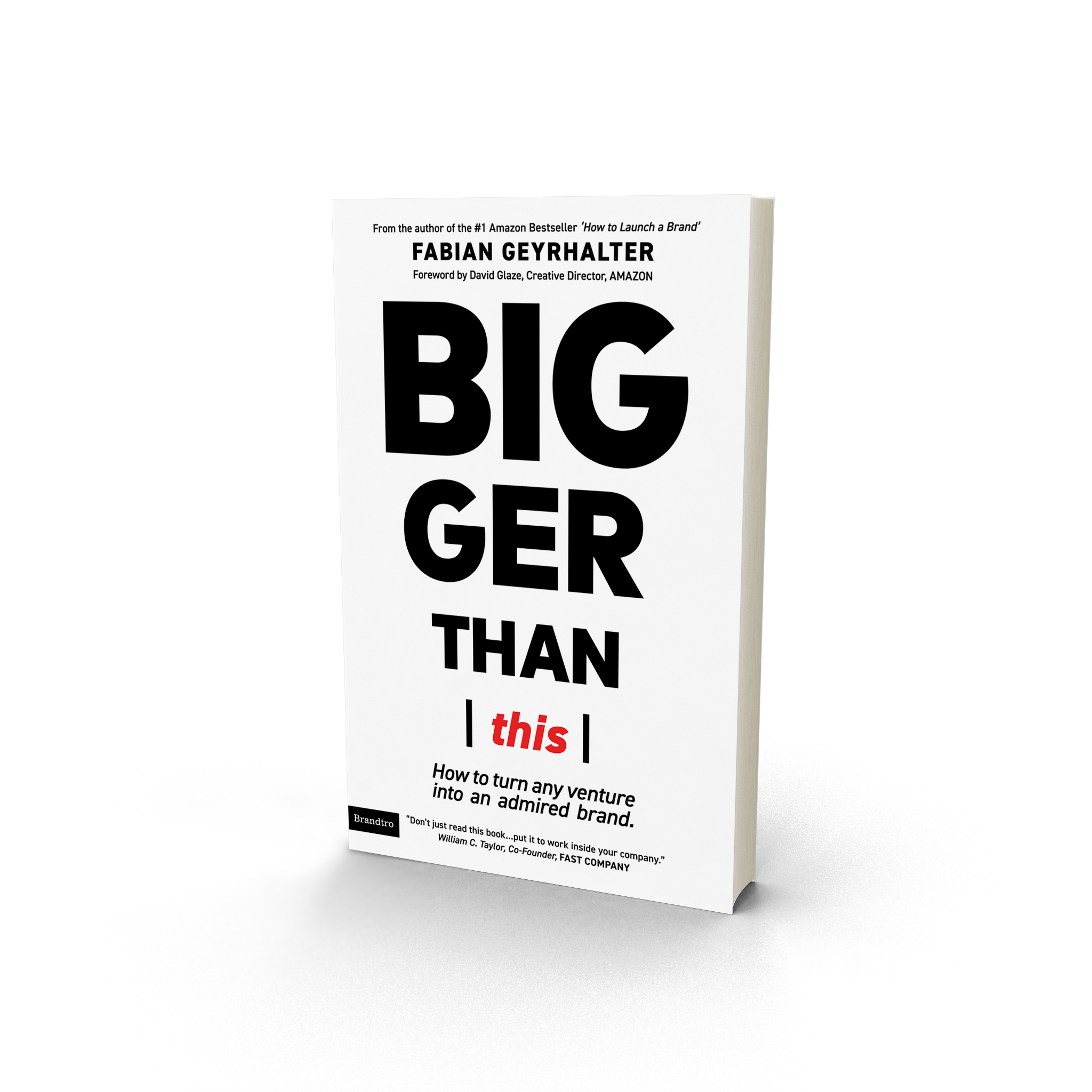
Bigger Than This
A quick read about the deceptively difficult task of turning your venture into an admired brand.
"Don’t just read this book...put it to work inside your company and in your career."Read More
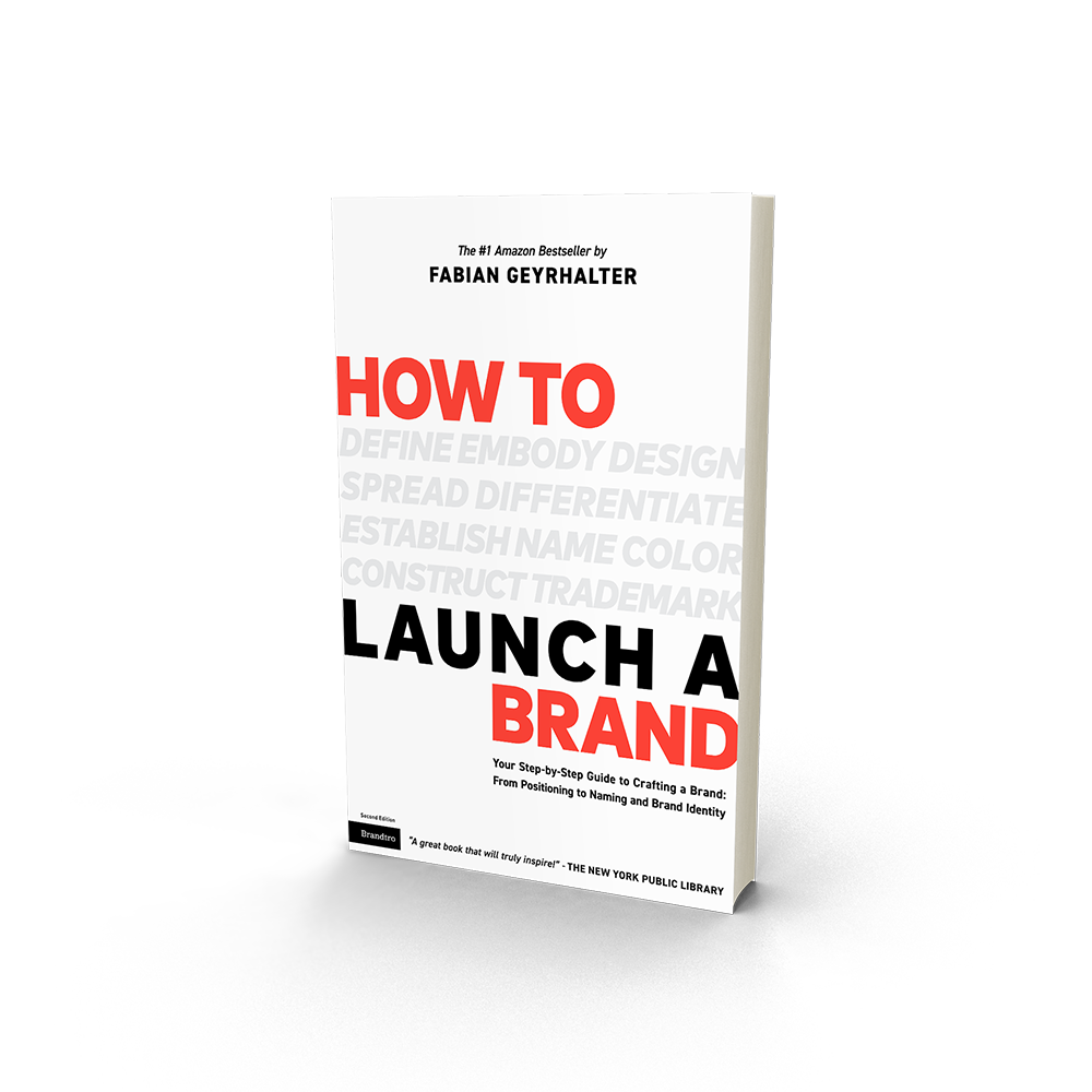
How To Launch A Brand
Your Comprehensive Guide to Launching a Brand: from Positioning to Naming and Brand Identity.
"Innovators everywhere will want to read this slim on size but hefty on advice [book]."Read More